.gif)

.gif)
I joined the WeatherCheck team in a busy time. The CEO had plans, design reviews with the Google UX team were fast approaching, and pitch meetings for investors and clients were on the close horizon.
My first task, lead the single address search redesign with the following goals:
Increased conversion from the initial address search to signing up their address for the dashboard.
Increased user knowledge as to what they can expect from signing up for the main property dashboard.
From the business side, they found that plenty of people we’re searching for their addresses using the search, but not many of them we’re entering their information to sign up for free property monitoring. It was my job to design a solution to this problem.
Immediately after joining, I settled in for an uphill climb.
From the very beginning, we had tight UI deadlines and not very much time to do user research.
To solve these process problems, I had to adapt to the environment and create UX processes to advocate for the user. I developed proto-empathy maps based on a few key assumptions.
Assumptions:
- Our users own homes
- Our users don’t know very much about the site or the app
- Our users don’t have hard set goals when they visit the website
- Our users don’t know if their properties have weather damage
- Our users are motivated to get either peace of mind or a claim
- Our users are over the age of 25
.png)
I then took Angela through the process of signing up her home using WeatherCheck’s platform. Adaptability sometimes means making do with what you have to get the job done. Here is her journey:
.png)
From this, I was able to synthesize the following POV’s:
As a homeowner, Angie Loren wants to know what WeatherCheck has to offer her because she wants to feel in control of her home.
As a homeowner, Angie Loren wants to know why WeatherCheck can come alongside her motivations so that she can accomplish her goals.
Using these POV’s, I was able to have ideation sessions with the CEO to come up with ideas that we funneled down into:
Changing the signup to a modal while displaying more information in the loading state while the product searched data records.
On top of this, we found that the current dashboard had no use to the user. We decided that the question we needed to answer was:
How might we connect users to their insurance agents in a seamless and non-intimidating way?
To help answer this question I was able to schedule a few phone calls with a general manager in training who was a regional manager of many contractors in our primary business area.
Finally, we can test some of the assumptions that we made initially. Through these phone calls, I was able to validate that the homeowner essentially has no connection to their insurance let alone understand how to remediate insured damage to their home.
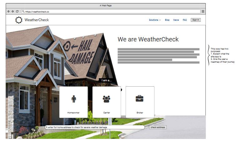
To help ideate and prototype more, I developed a series of sketches and low fidelity wireframes using balsamiq to concept test our ideas:
.jpeg)
(1).jpeg)
My sketches

My lo-fi balsamiq prototype with annotations
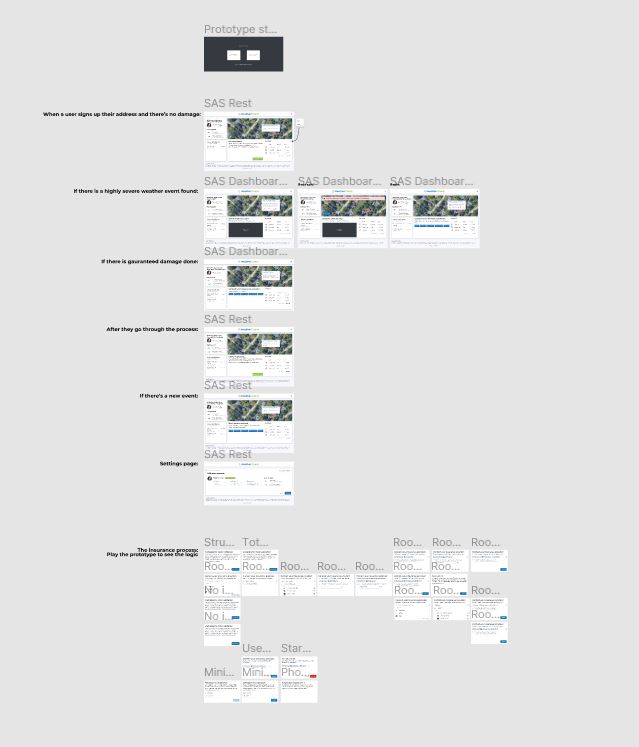
This is the interactable prototypeThe initial solution was an acceptable MVP, but we knew from our research that we needed to iterate.
We had a design review with the Google UX team, and their feedback helped us understand that connecting the user and the insurance agent was our next solution. I developed a process that allowed us to have the information necessary to discover who their insurance agent was and provide the necessary steps to start a claim.
Our goal was to make sure no user had to think very much: come to our site, and we will ask you the right questions and provide you the resources you need.
The final VD was approved by the CEO, and I prepared files for developer handoff.

The "useful" dashboard. Our MVP.

The final VD with the insurance process
This is the interactable prototypeBy this time, the company was pitching sales to the state of Tennessee using prototypes and screenshots of my design. They were proving valuable as WeatherCheck landed a contract monitoring every government building in Tennessee.
After this first iteration, I was able to schedule a phone interview with one of the largest property managers in our main region, Twiddy.
I was able to interview their CEO on their process of remediating their homeowners damage and we were able to come up with new problems to solve like flooding and rain.
.png)
Iteration 2 of the dashboard
Features added: viewing your insurance connections.

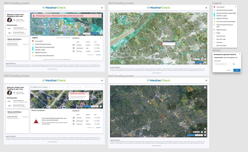
Iteration 3 of the dashboard
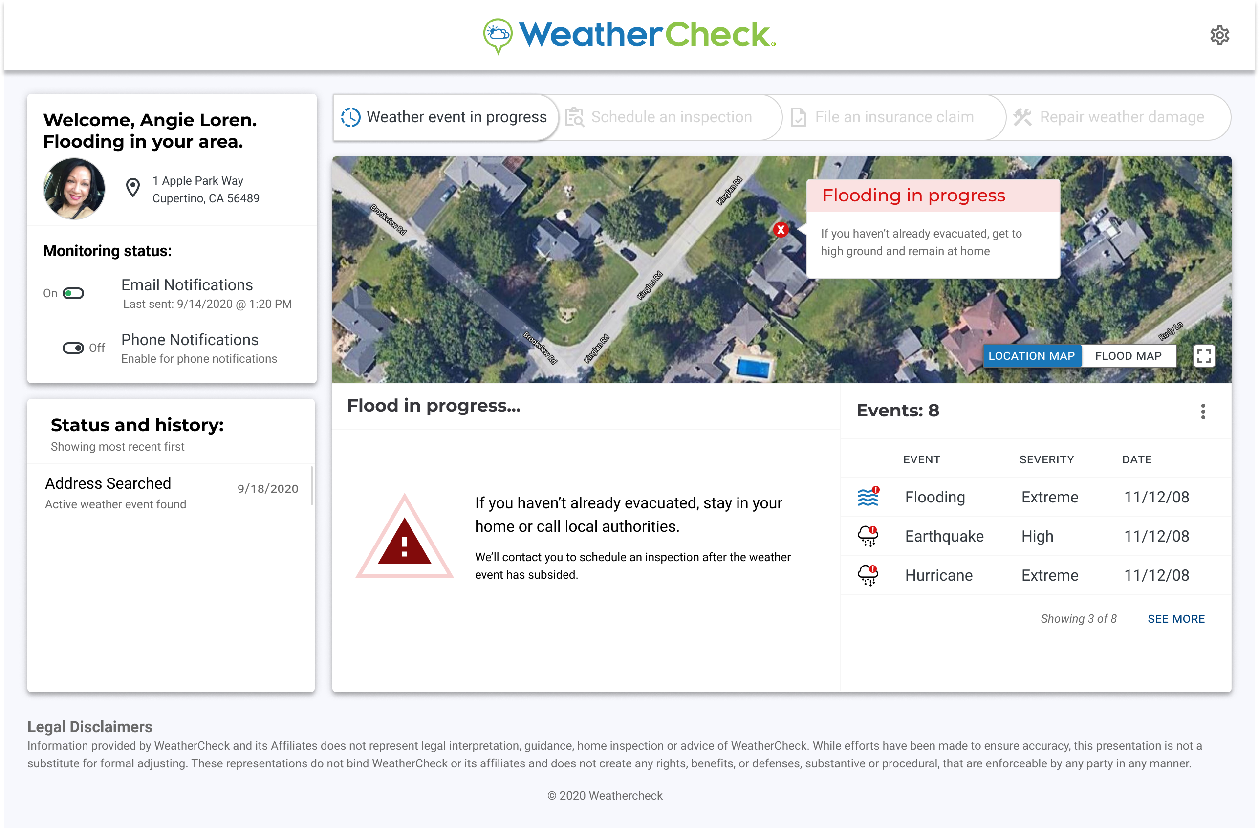
Features added: flood maps, screenshot abilities, sending screenshots to insurers, progress bar to show you where you are in the process.

Closeup of iteration 3
.gif)
Animated iteration 3 using Principle
In retrospect, we accomplished our goals and more. We earned more revenue for the company and effectively created a better user experience.
Iterating was a strong tool for this project. I learned to navigate through the design process in a non-linear fashion. As we gained more research, we implemented our new discoveries into our solutions. I learned the value in staying attentive of our user's problems even after our initial discovery research.